Designing for Impact: A Brand-Focused Microsite Experience
⚠️ Signed under NDA:
Due to a non-disclosure agreement and to protect client confidentiality, some details may be intentionally vague.
Client
University Health Network Foundation
Project type
Time
July – Dec 2024
Tool
Role
Overview
About Project
Building blocks for new CMS
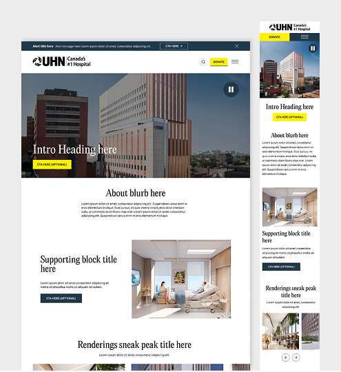
We created a microsite to showcase a new surgical building while maintaining brand aesthetics for a cohesive and engaging experience. The CMS was built in WordPress, enabling seamless content implementation and flexibility.
The goal
Flexible and engaging microsite
Optimized Content & Brand Awareness
The goal was to create a microsite that highlights new surgical building, raising brand awareness and engaging the community and major donors. Flexible content blocks were designed for easy updates and future expansion while maintaining a compelling and visually consistent experience.
Design Process
Wireframes
The layouts
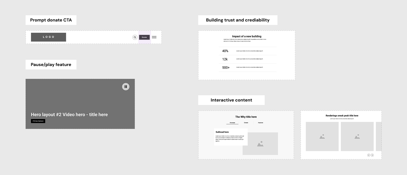
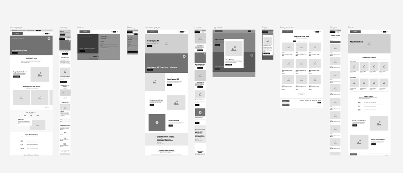
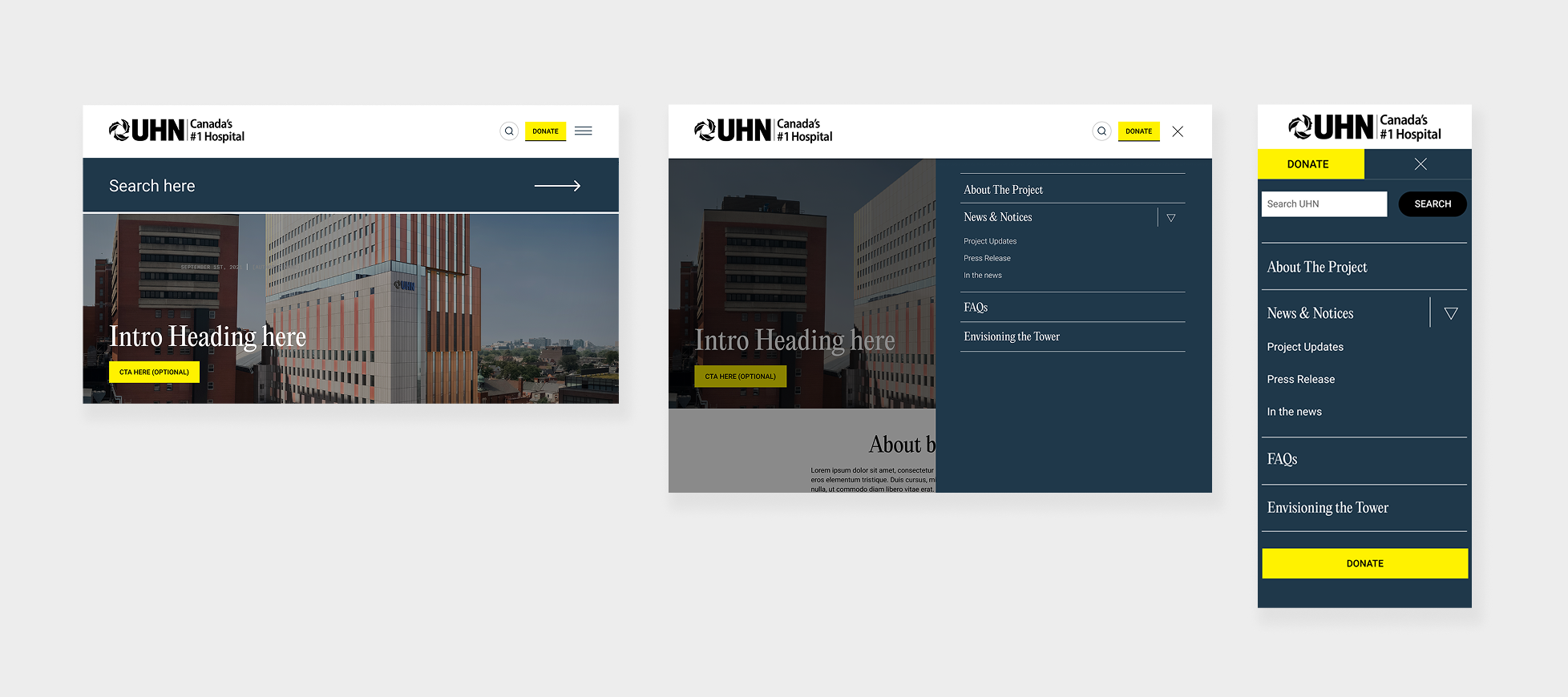
To target major donors and the community, we considered factors such as accessibility (e.g., a pause/play feature), clear navigation, and a mobile-first approach. Layouts and content blocks were carefully planned to guide donors through the site and encourage engagement.
For example, a prominent ‘Donate‘ call-to-action button and a hamburger menu were included to emphasize the donation process. These wireframes provided a strong foundation for the visual design.
Final designs
Bringing the Vision to Life
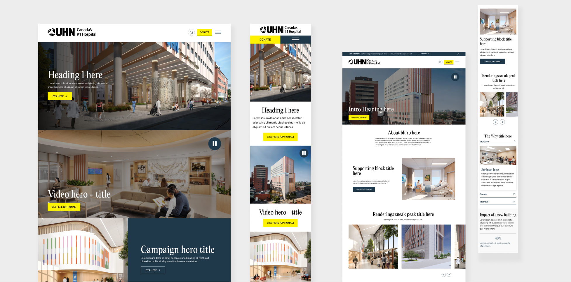
Building on the wireframes, we opted for a clean, minimalist design, using a generous amount of white space and typography to maintain the aesthetics of UHN Foundation site.
Accessibility remained a priority, with features like a play/pause button for background videos, ample white space, and imagery to break up content and help maintain readability, particularly on internal pages. The final design ensured a visually compelling and user-friendly experience while aligning with the project’s brand and donor-focused goals.
Impact & reflection
Balancing Aesthetics and Usability
Designing with flexibility in mind was a great learning experience, allowing me to think beyond myself and work closely with developers to help the UHN team easily update content. Balancing aesthetics and usability to ensure key information was clear was sometimes challenging, but the wireframe stage helped provide the necessary structure before moving forward with visuals.
Watching the final site come together was very rewarding, especially knowing it would help raise awareness and support for such an important cause.
